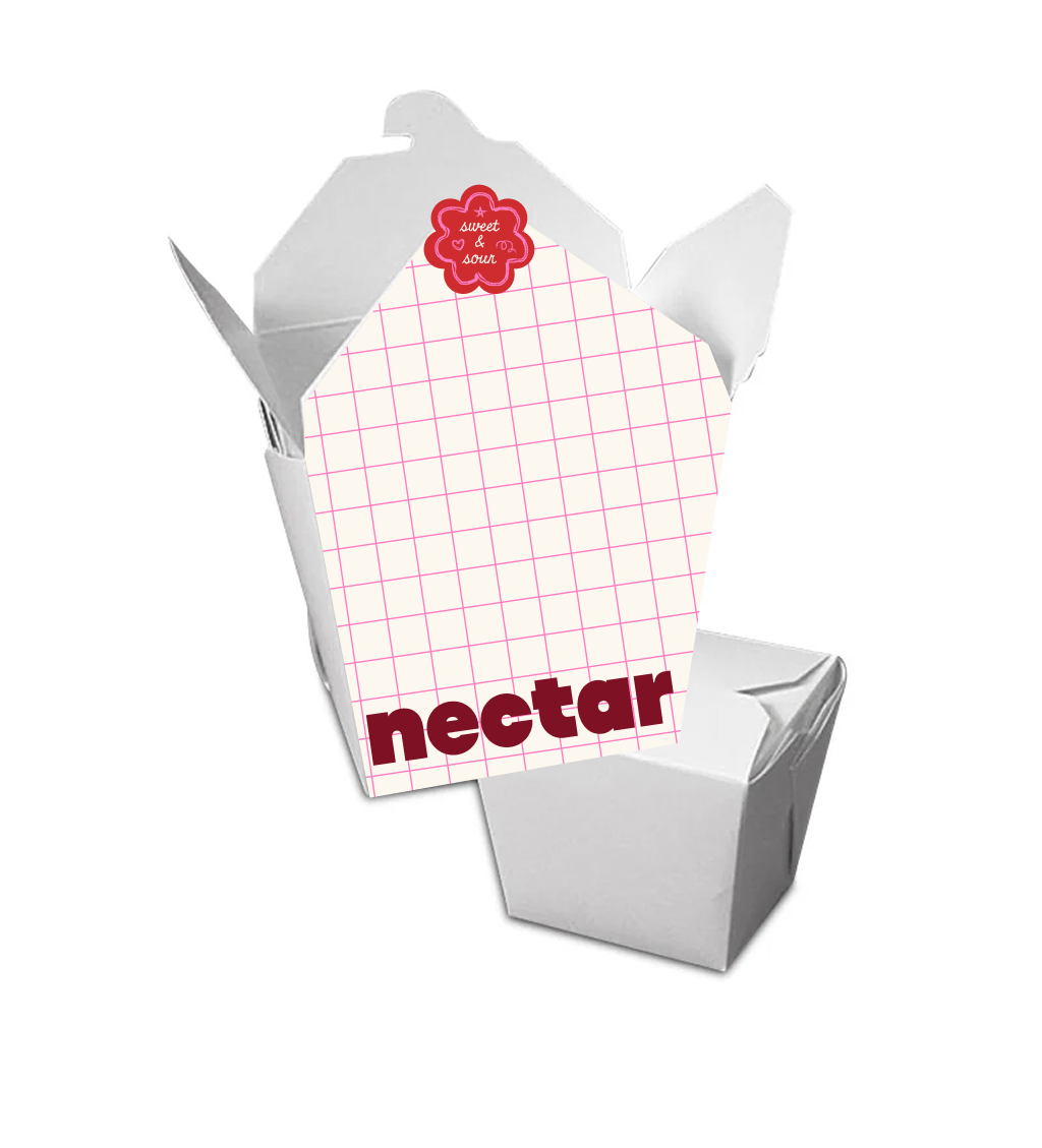
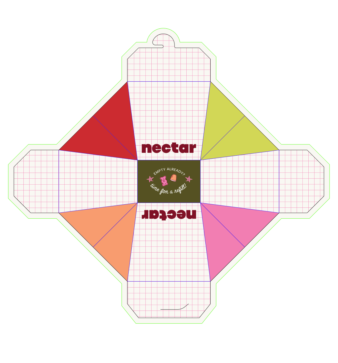
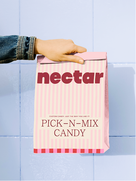
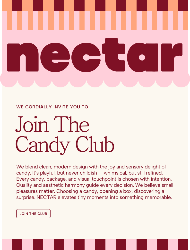
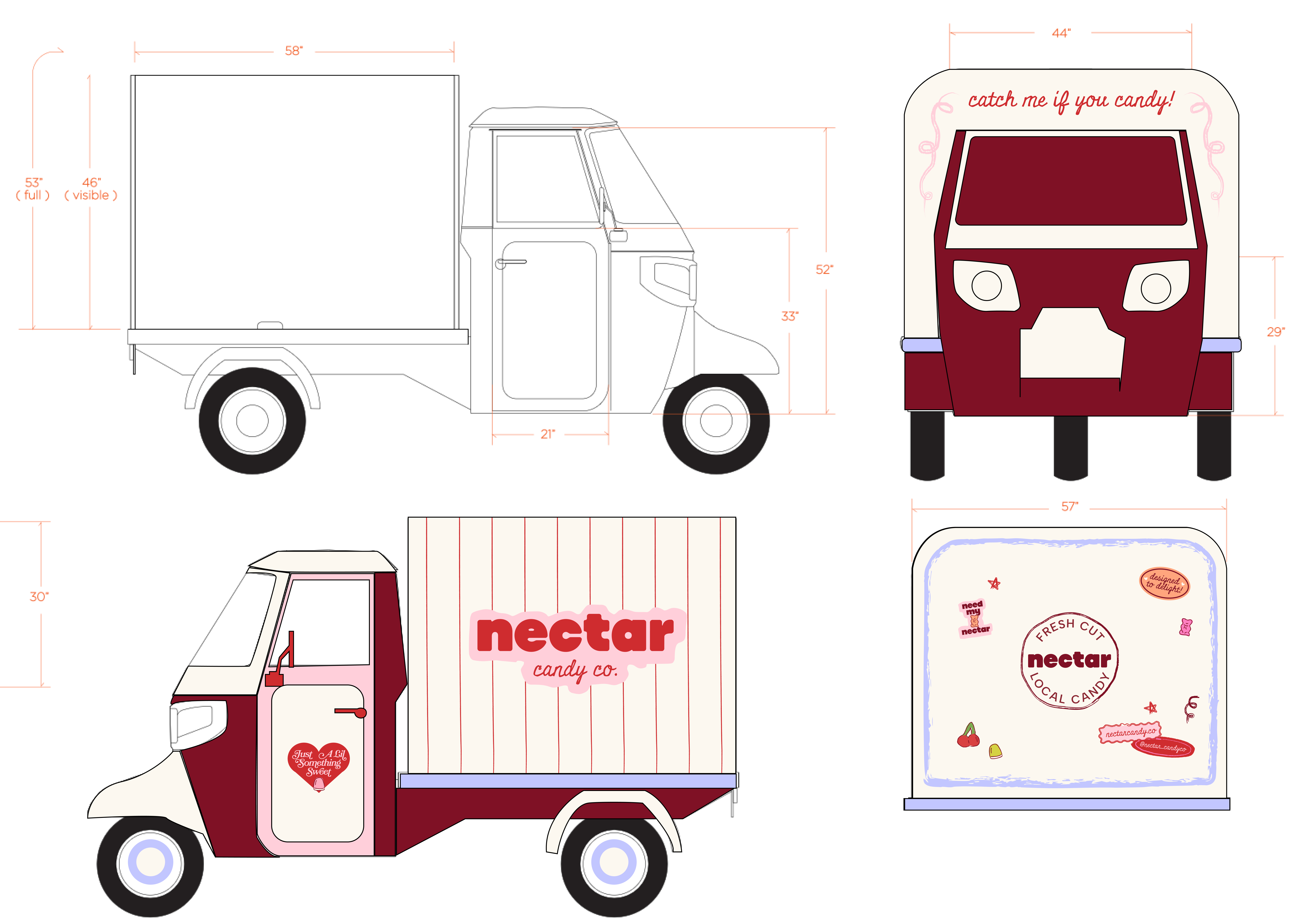
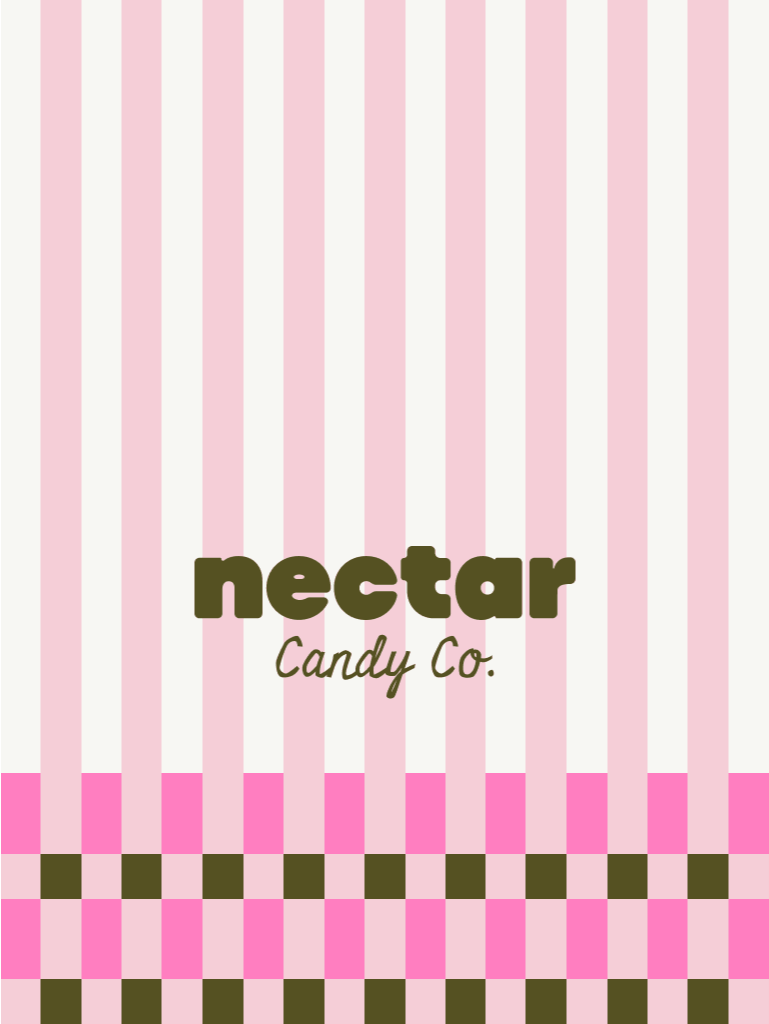
NECTAR is a swedish candy cart that came to me with some initial branding that they wanted expanded, refined, and refreshed! We did 2 design days back-to-back, starting with the brand refresh. Day one, I updated their logo, tweaked the color palette to be more usable, and updated the fonts to be more elevated and less cutesy. I drew some custom swedish candy illustrations, created hand-drawn stickers, and brand patterns! Day 2, I focused on designing on the packaging for the bags, cartons, and the cart itself!
Design play day 🛝 (brand refresh)
Design play day 🛝 (packaging)


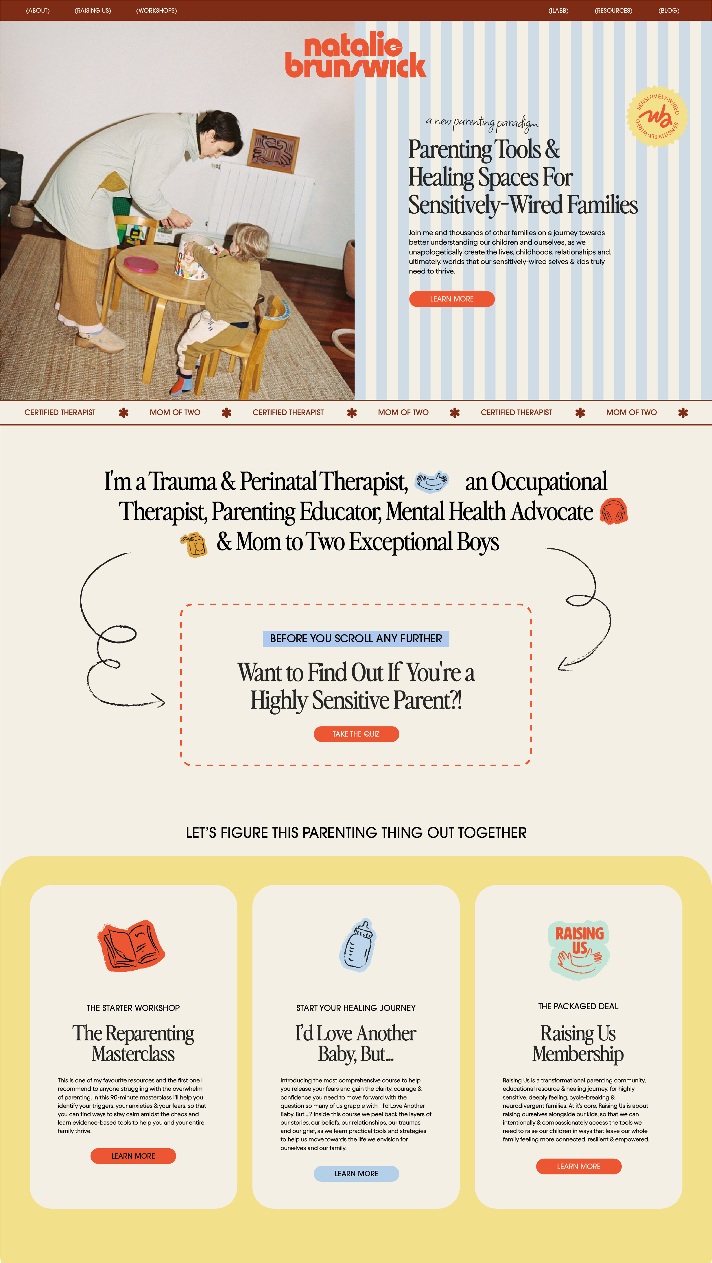
Write your portfolio heading here
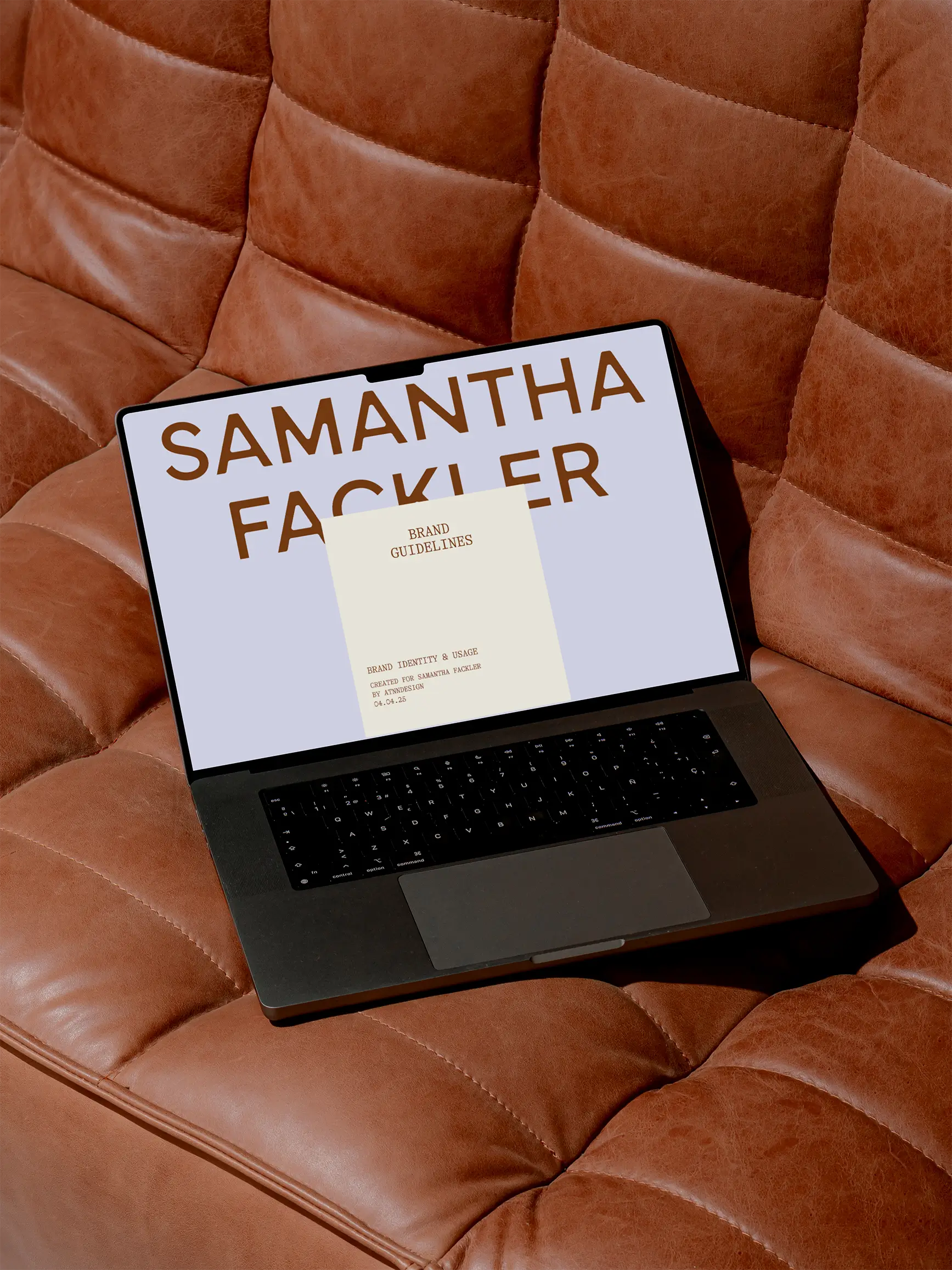
Samantha Fackler is a business coach, incorporating spirituality and energy in her practice. The goal for this brand was communicating the two sides—a balancing act between grounded professionalism and holistic warmth.
Write your portfolio heading here
Samantha Fackler is a business coach, incorporating spirituality and energy in her practice. The goal for this brand was communicating the two sides—a balancing act between grounded professionalism and holistic warmth.
Write your portfolio heading here
Samantha Fackler is a business coach, incorporating spirituality and energy in her practice. The goal for this brand was communicating the two sides—a balancing act between grounded professionalism and holistic warmth.
.gif)
Write your portfolio heading here
Samantha Fackler is a business coach, incorporating spirituality and energy in her practice. The goal for this brand was communicating the two sides—a balancing act between grounded professionalism and holistic warmth.
"A slight retro, european influence, but something fresh, bright, and charming."
Samantha Fackler is a business coach, incorporating spirituality and energy in her practice. The goal for this brand was communicating the two sides—a balancing act between grounded professionalism and holistic warmth.

Versatile, Recognizable, and Iconic.
For the candy cart design, Nectar told me they plan to cater popups & events ranging from casual to very formal. For this reason, I knew I had to make the cart easy to recognize, and cute enough to make people want to snap a picture with it—but it had to have some sophisticated, cleaner elements so it wouldn't clash with different locations.
Write your portfolio heading here
Samantha Fackler is a business coach, incorporating spirituality and energy in her practice. The goal for this brand was communicating the two sides—a balancing act between grounded professionalism and holistic warmth.
“There’s a typical look in my industry and I wanted it to feel completely fresh—it totally does that and more”
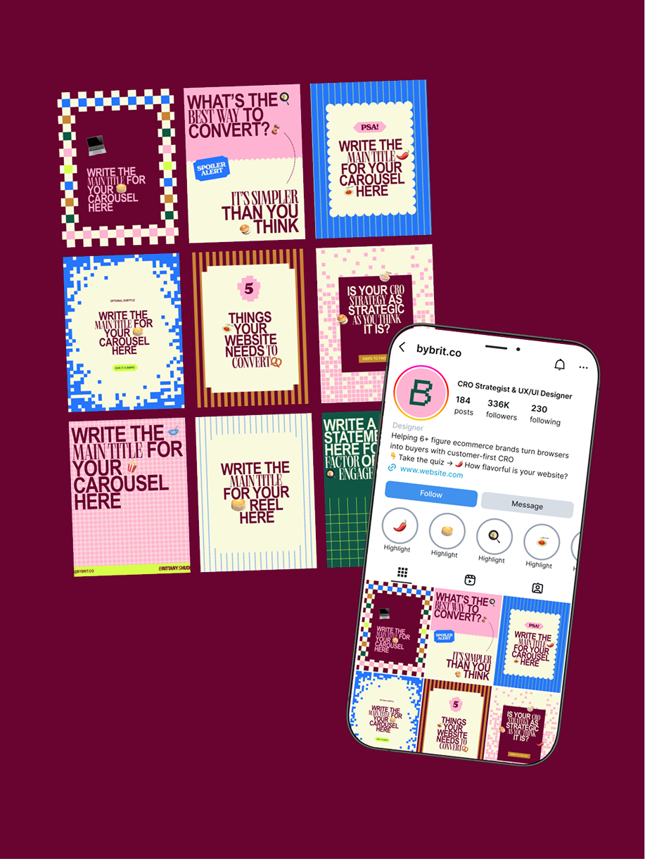
Regardless of whether my clients work with me for their website or not, I provide them with a sample idea of what their branding could look like on a website to make sure they’re approving the look, the feel, and the application.