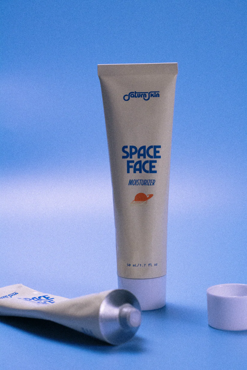
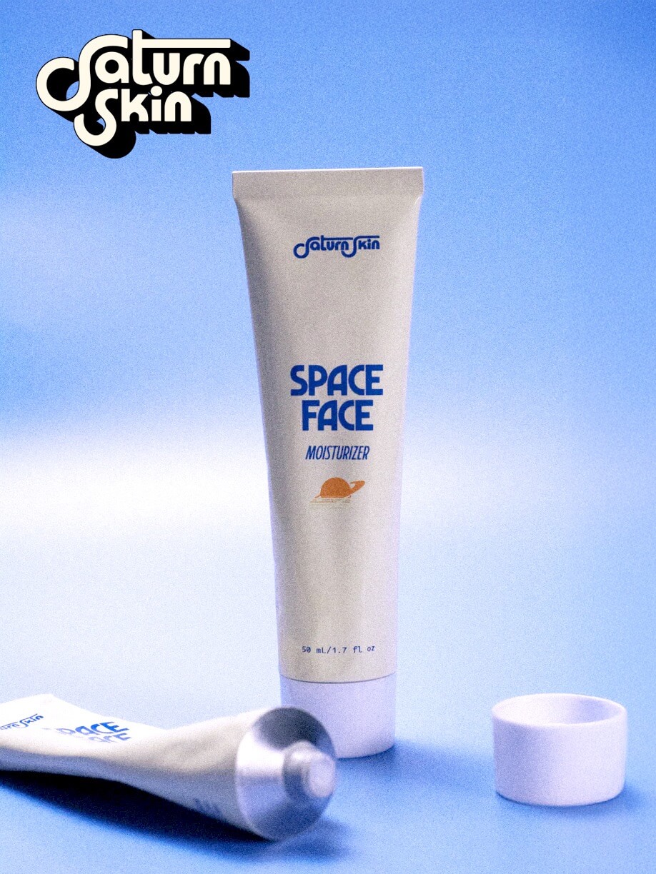
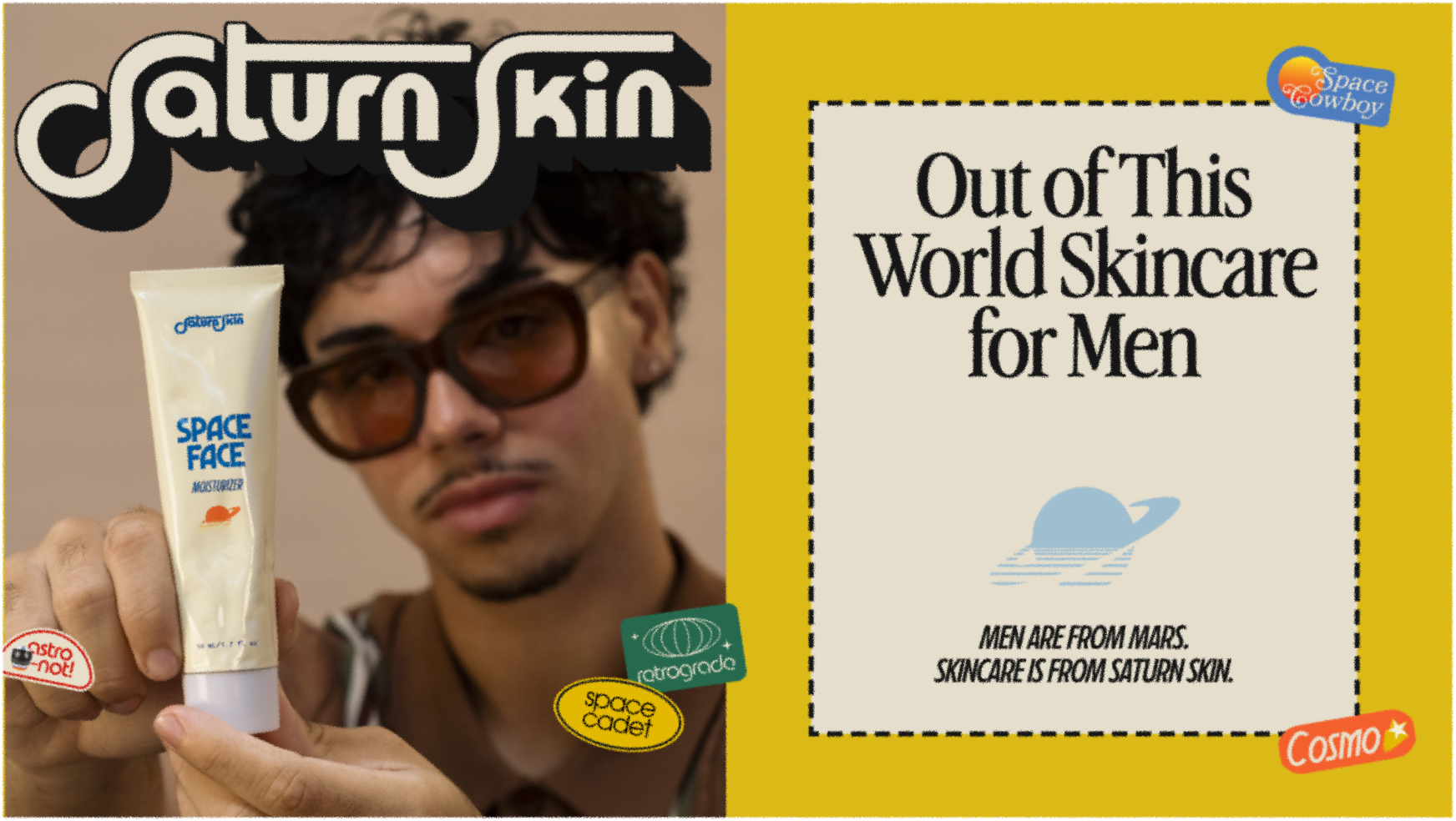
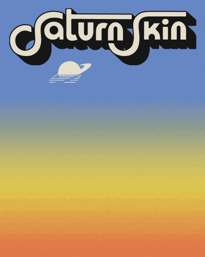
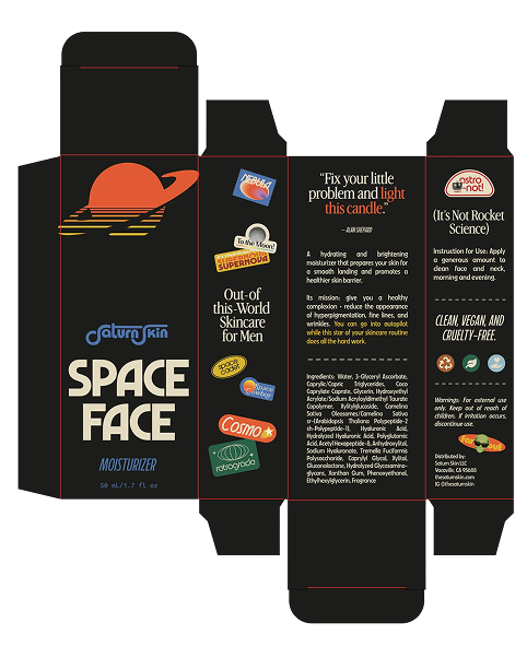
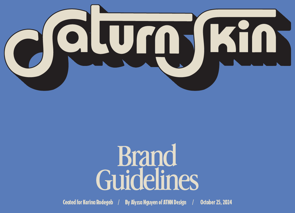
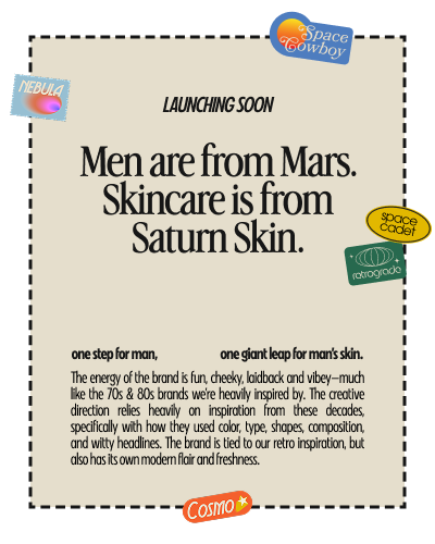
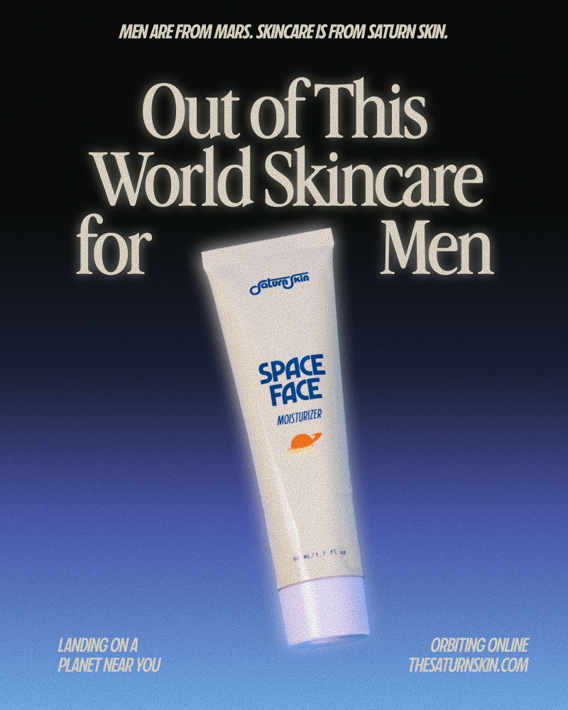
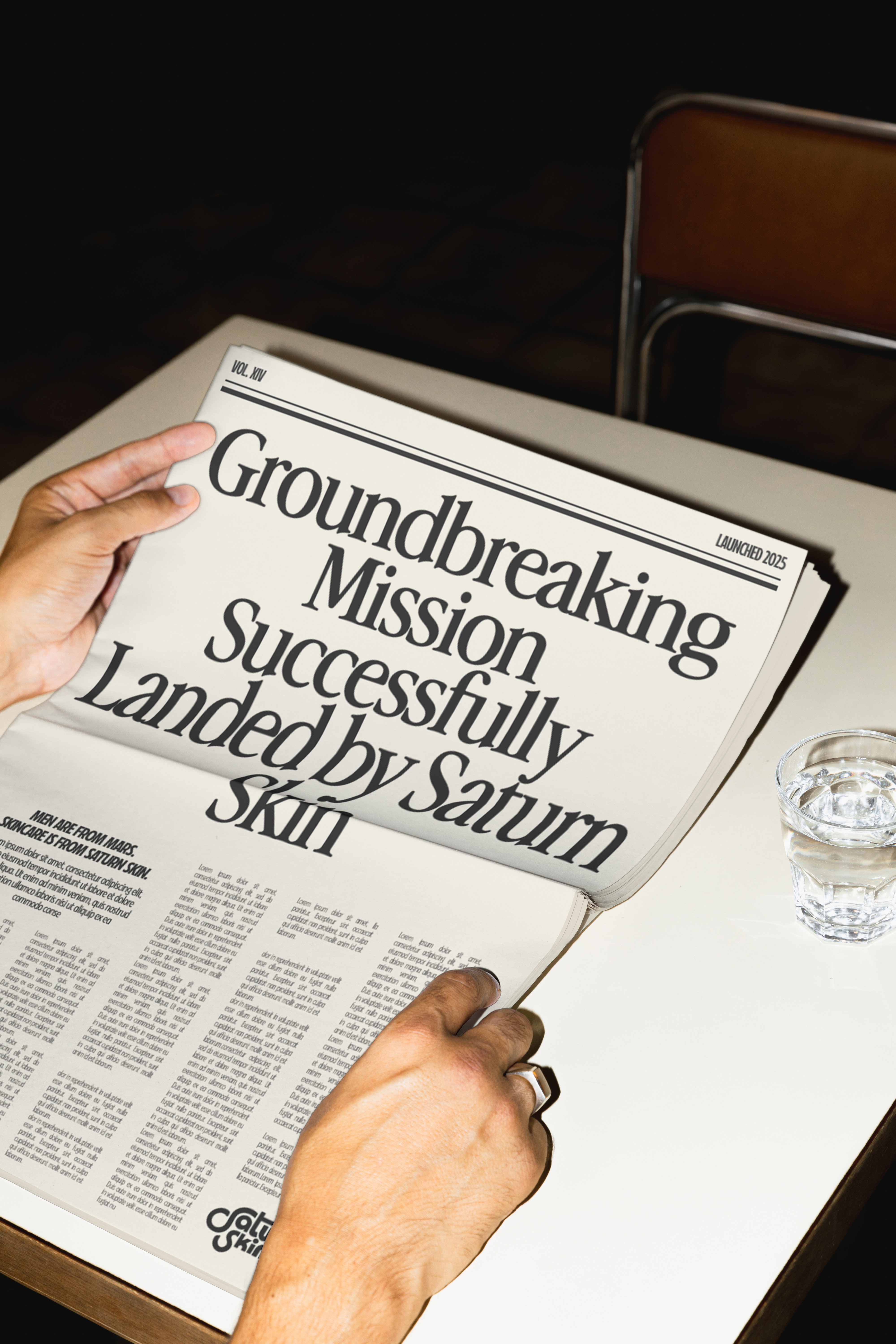
Saturn Skin came to me with a simple request: retro, space, and not-your-typical men’s gray & navy branding. They’re on a mission to make self-care for men as fun and cool of an experience as it is for women, and I enlisted to help take it out of this world! 🪐
BRAND TAKEOVER 🤠
SHOPIFY WEBSITE 💻
DESIGN PLAY DAY 🛝

Write your portfolio heading here
Leap is an innovative e-commerce brand providing eco-conscious and empowering period products. For this project, the client wanted inspiration to work from our previous .
Creating a Brand from Scratch, and Bringing it Life
Leap is an innovative e-commerce brand providing eco-conscious and empowering period products. For this project, the client wanted inspiration to work from our previous .
Write your portfolio heading here
Leap is an innovative e-commerce brand providing eco-conscious and empowering period products. For this project, the client wanted inspiration to work from our previous .
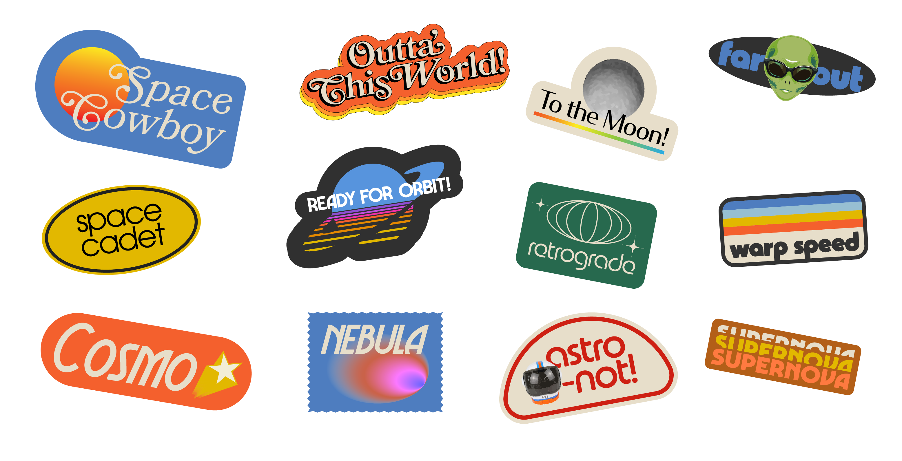
Custom Hand-Drawn Illustrations
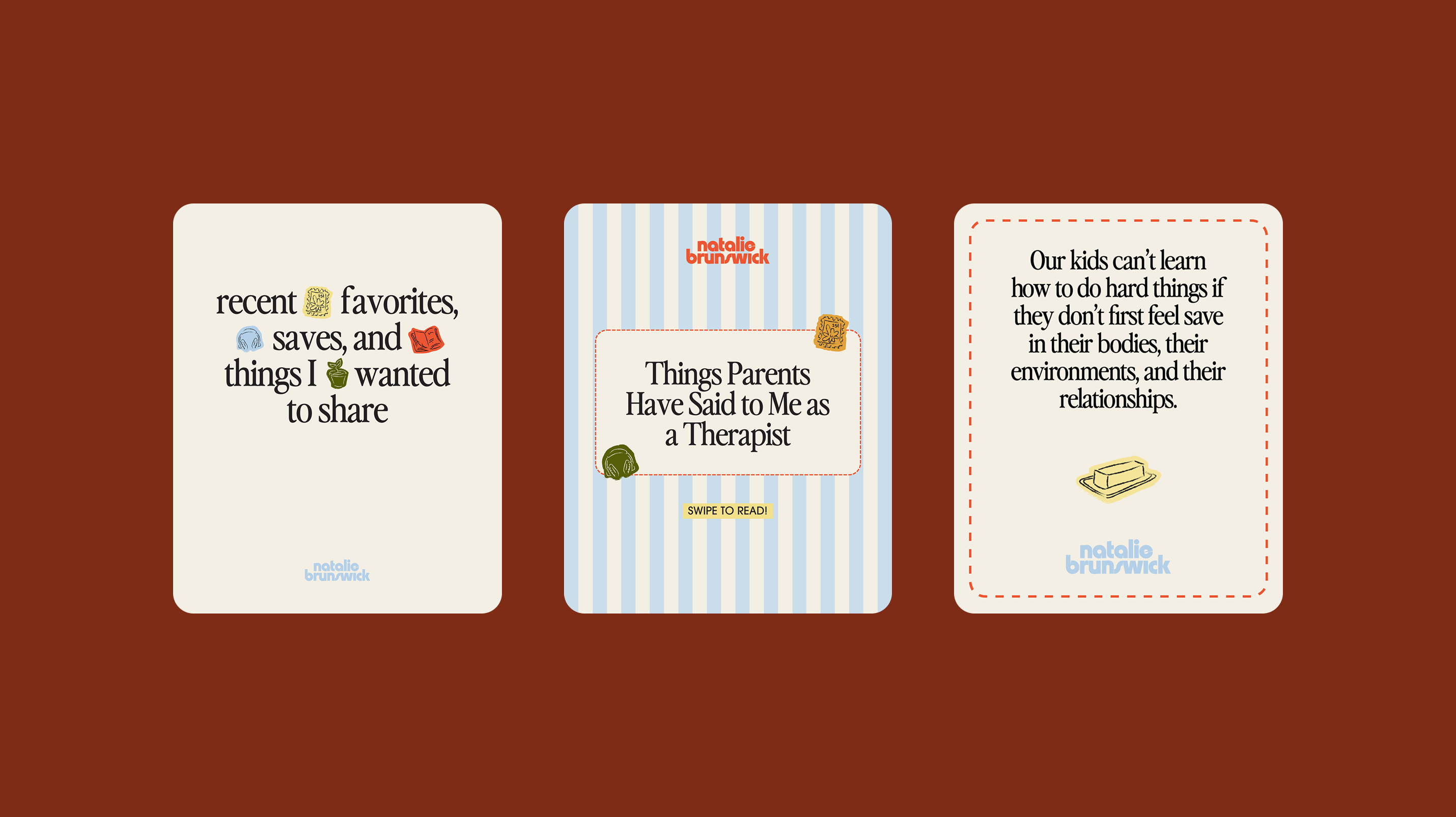
For more texture and personality, I created 24 custom illustrations, including parenting-centered objects, as well as a few objects representative of Natalie’s hobbies, favorites, and vibes.
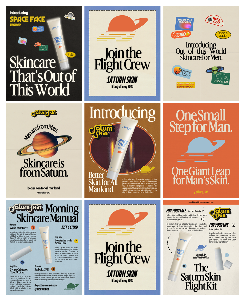
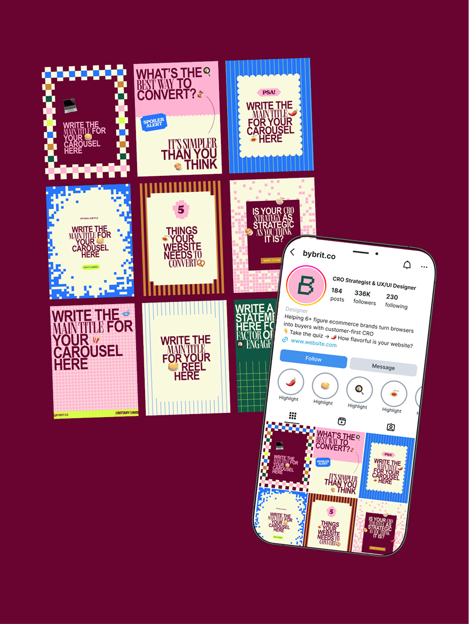
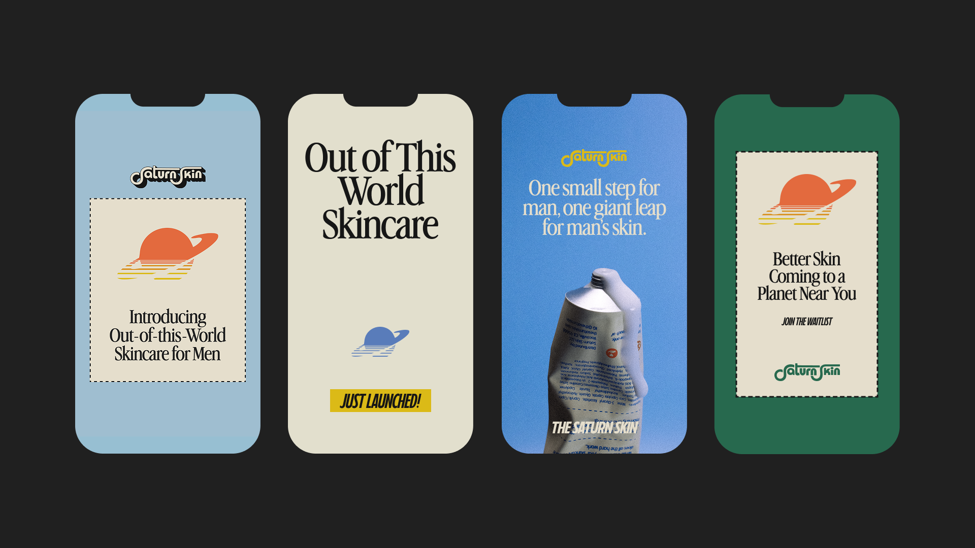
Retro Magazine Ad-Inspired Social Templates
The style of the social templates were a combination of 60's, 70's, and 80's print advertisements to take the retro vibe a take further.
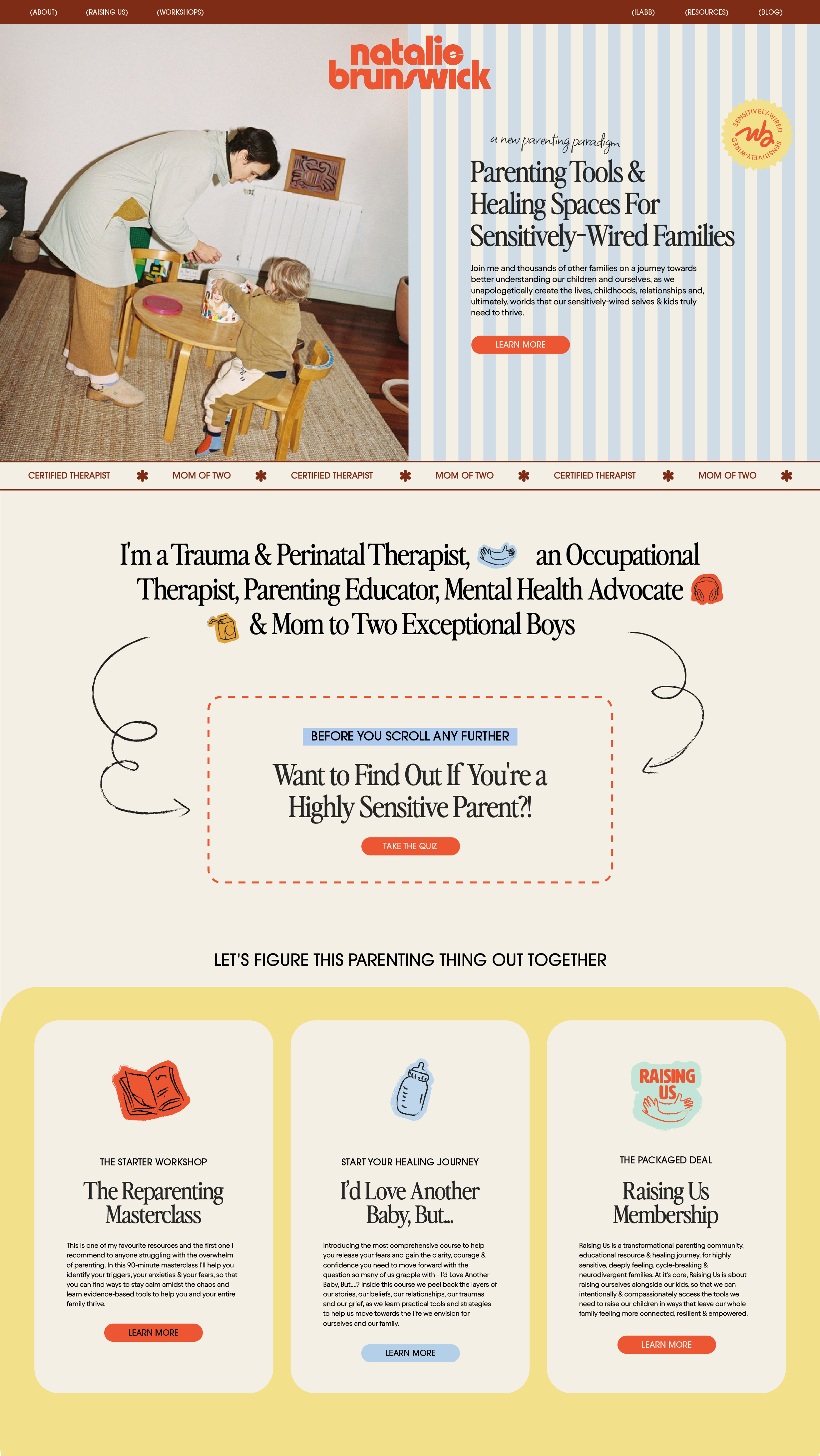
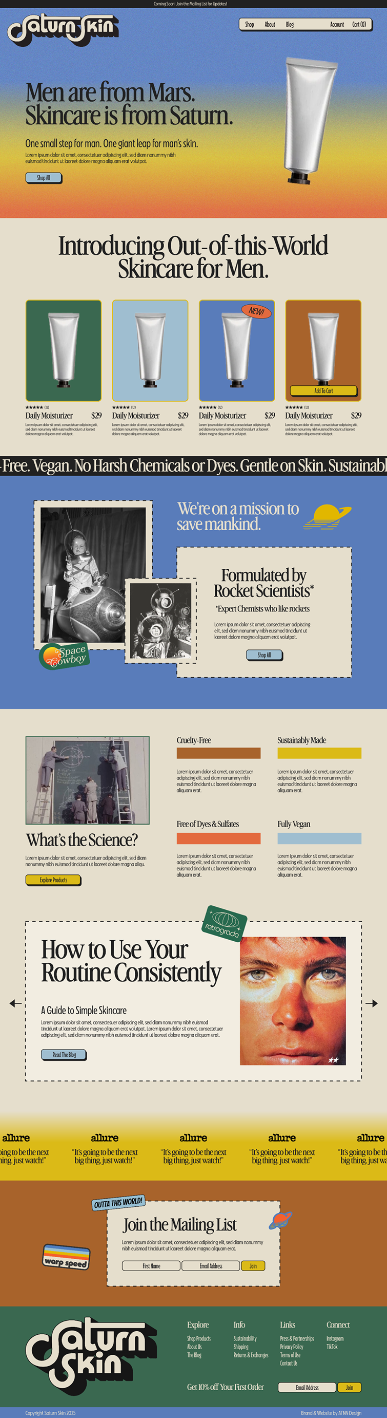
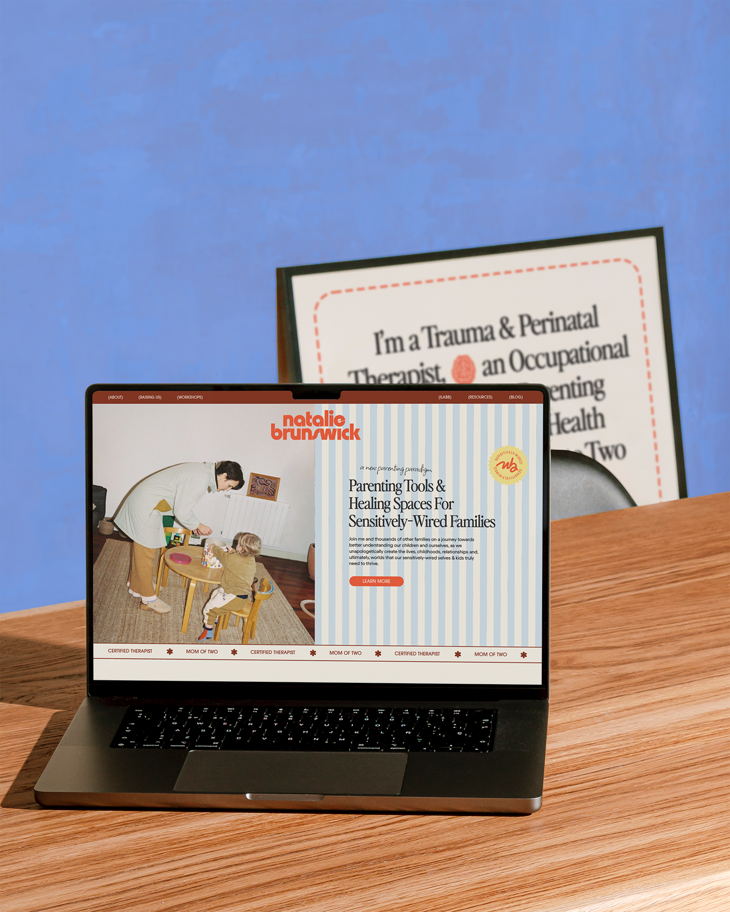
Custom Designed & Developed Shopify Website
This was a custom website, using no pre-templated sections! It features floating animations for a space-like interactive experience, and a mixture of clean layouts + retro layering for an immersive but easy-to-use website.

“There’s a typical look in my industry and I wanted it to feel completely fresh—it totally does that and more”
Regardless of whether my clients work with me for their website or not, I provide them with a sample idea of what their branding could look like on a website to make sure they’re approving the look, the feel, and the application.
"You understood my vision and made it even better than I could've imagined."
Regardless of whether my clients work with me for their website or not, I provide them with a sample idea of what their branding could look like on a website to make sure they’re approving the look, the feel, and the application.
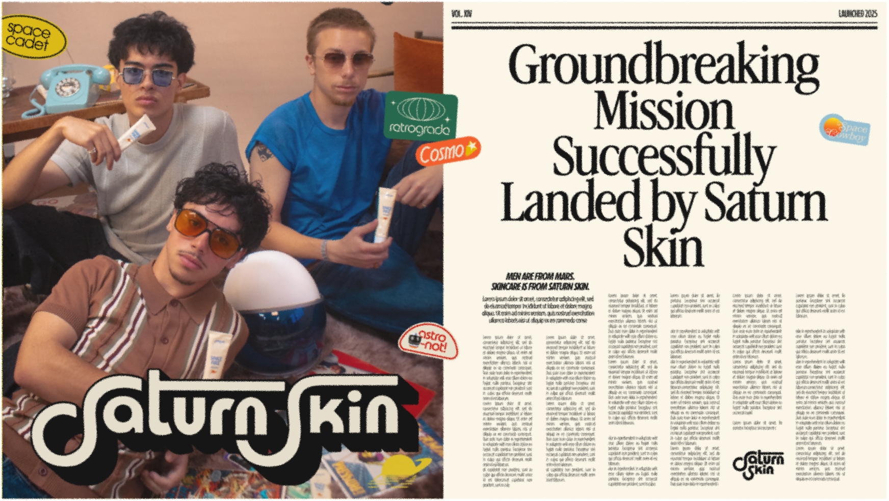
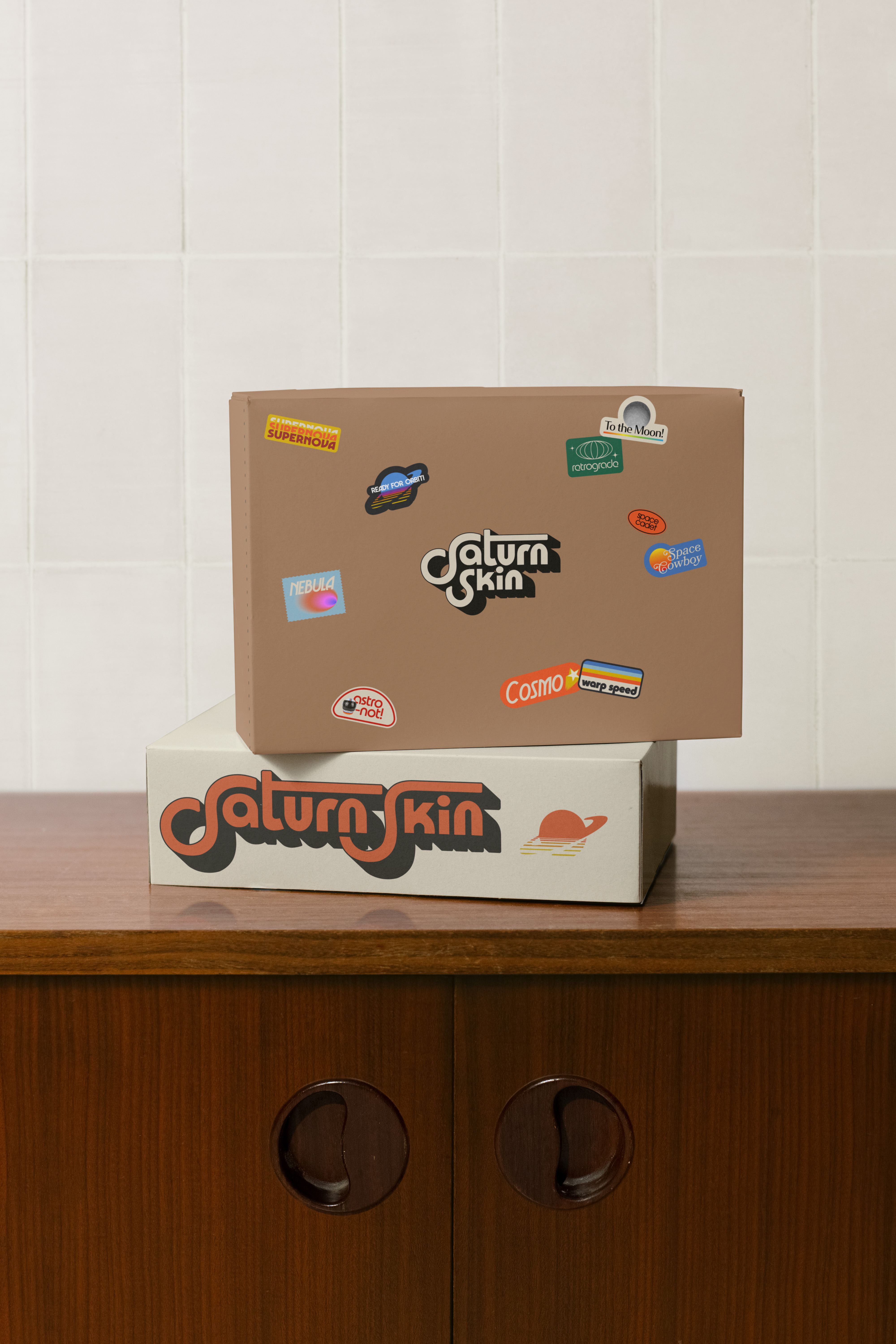
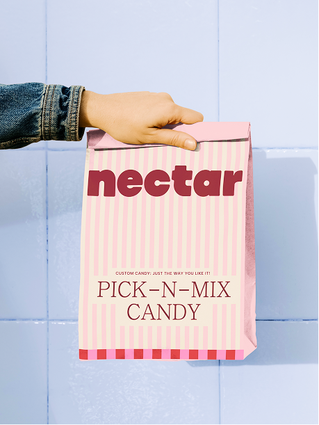
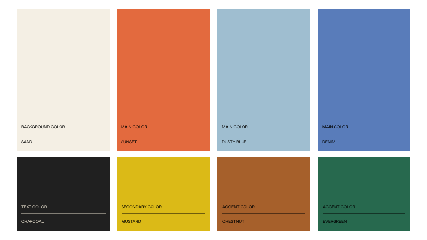
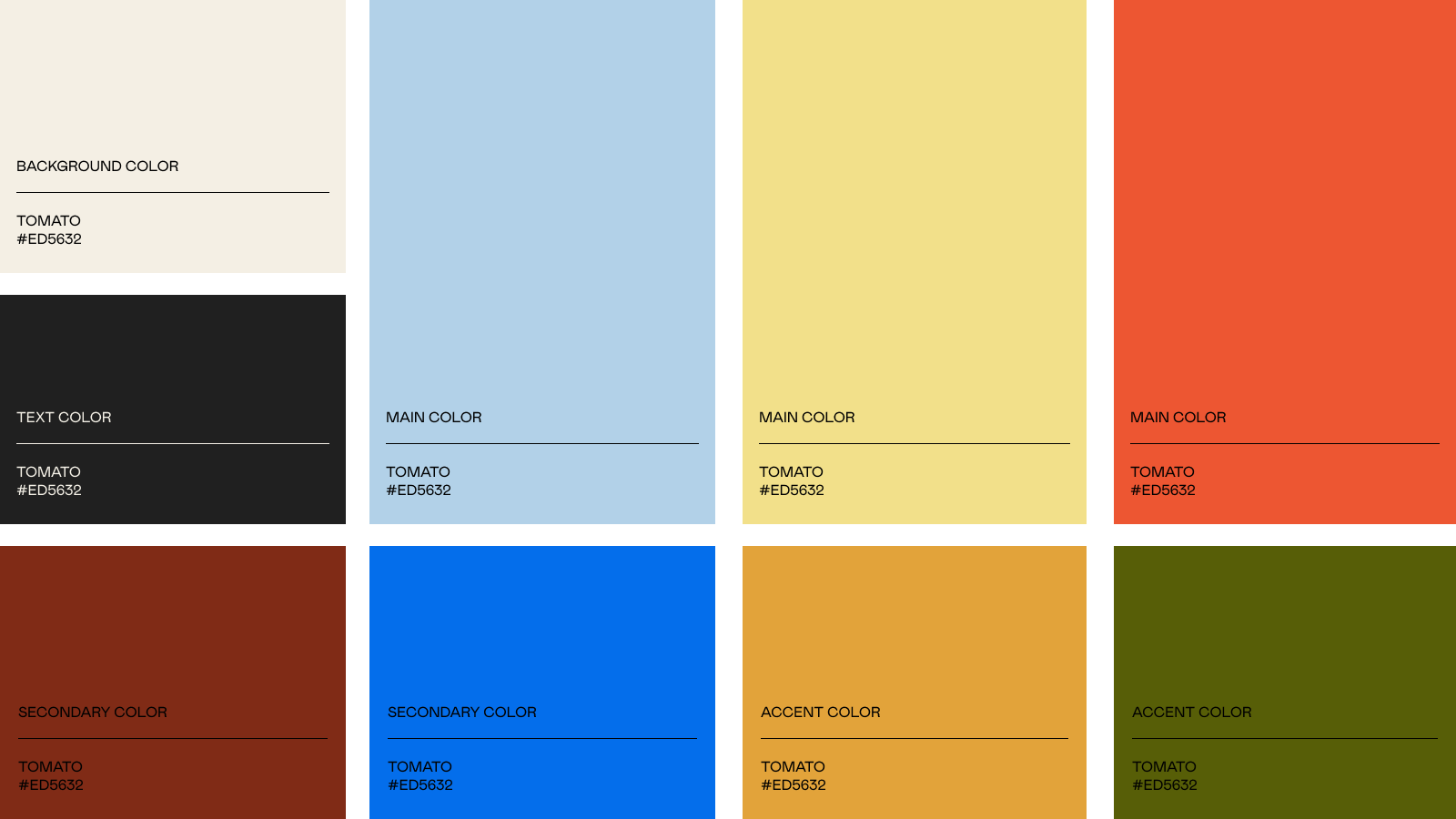
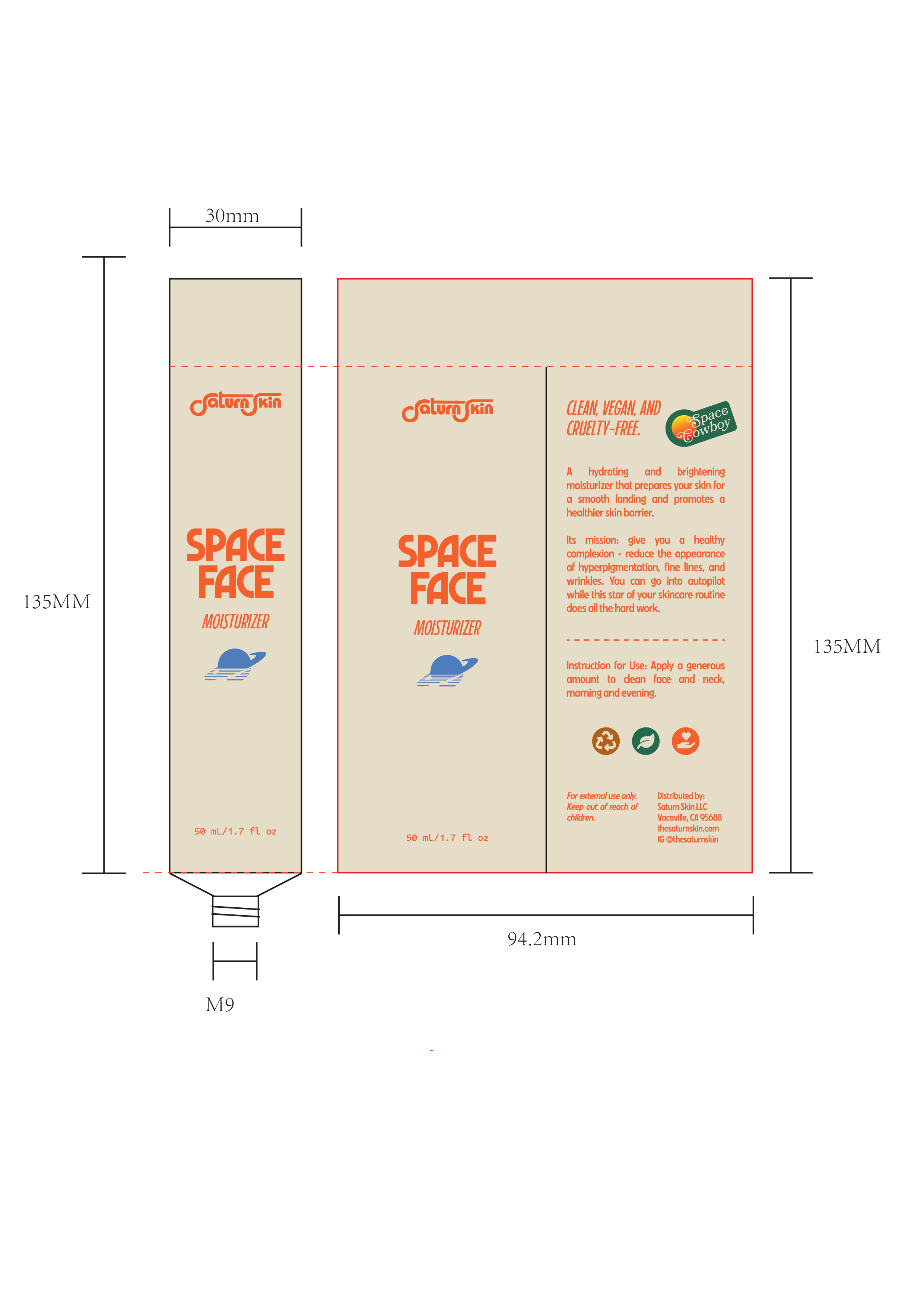
Branding That Translates to Both Digital & Print
Knowing this is a product-based business, I made sure all of the design choices would make the brand look amazing in both mediums. That meant choosing a CMYK/Pantone-friendly color palette and making the layout use print and physical elements like paper and stickers.